| OTHER ARTICLES |  |
| OTHER ARTICLES |  |
Note: Symbols were depicted in the animation with very inconsistent proportions in many cases. My illustrations have been done with intention of using the most geometrically neat and visually appealing proportions (which usually amount to the same thing) within the limits imposed by the more consistent aspects of their appearance in the animation.

This flag appears after TMS. The best explanation for the contexts in which it is seen is that it's the flag of the global state.
I have devised the following explanation for its design: a phoenix surrounded by an aura of flame, which is a symbol of renascent strength and renewal, rising from the scorched earth (the burgundy field), representing the transcendence of nature and man from the devastation caused by the war between Earth and the Zentraedi.
The logical, most obvious and most likely immediate predecessor of the 'rising phoenix' flag is, of course, the real-world UN flag:

 |
 |
In TMS the emblem of the UEF consists of a stylised arrowhead on a disc. The disc could be a shield, and it could represent defence and the arrowhead offence. Red and white are associated with war and peace respectively. At some point after the events of TMS the arrowhead emblem is replaced by a triangle that displays a zigzag that resembles the letter 'M'.
That the initial 'M' is sometimes superimposed on the TMS era emblem very conveniently links it to the post-TMS era emblem. However, we're still left with the problem of what the 'M' stands for. Perhaps the best explanation is that the UEF has a motto beginning with 'M'.

Some people have claimed that the triangular emblem represents only Mars Division or Mars Base (as Mospeada's creators may have intended). However, its ubiquity, prominence, and the contexts of its appearance, indicate a broader meaning than 'Mars' forces. That it represents the entire UEF is the most plausible explanation.
It has also been claimed that there is an emblem incorporating a 'J' that represents 'Jupiter Base' or 'Jupiter Division'. However, neither a 'Jupiter Base' nor a 'Jupiter Division' is ever mentioned. In episode 83 Sue Graham states that she is from Jupiter Section, which is the only reference to 'Jupiter' (other than the planet named after the same Roman god). But her camera and synchro-cannon (and ships that return to the solar system around this time, and their occupants) bear the triangular emblem. Having examined the animation thoroughly for appearances of the alleged 'J' emblem, I am certain that it does not appear anywhere in the TV series.
There are variants of the triangular badge with one or two stripes above the zigzag. These denote rank classes. See Rank Insignia of the Armed Forces of the World Government.

The TMS-era flag is seen briefly in episode 1 on the left side of Captain Gloval's car. It consists of the emblem of the UEF on a white field. That this is the simplest flag that depicts the UEF emblem suggests that it represents the entire UEF. The replacement of the arrowhead emblem by the triangular emblem after the events of TMS would require a corresponding change to the flag.
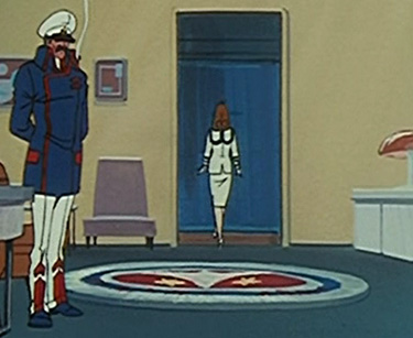 |
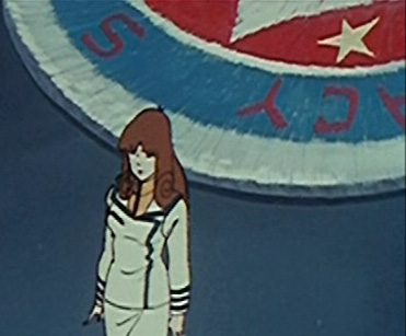 |
The stars do not refer to Captain Gloval's rank. He is not a 'two-star' officer at this time, and in any case it would be too strange for his rank to be represented on a rug. The other obvious conclusion is that they represent the Spacy. The text surrounding the UEF emblem seems to include 'SPACY', which suggests that this particular version of the emblem is specific to that service. The naval equivalent, for example, could have anchors instead of stars.
 |
 |
See below ('Flag in Admiral Hayes's Office') regarding the concentric circles.
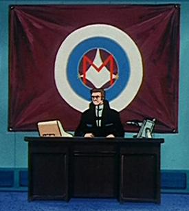
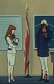
That this flag is displayed so prominently in Admiral Hayes's office implies that Hayes has a strong connection with what it represents. That he is an admiral means he is a member of either the Navy or the Spacy.
Blue and white is a colour combination normally associated with navies. However, this particular shade of blue is more air force-ish than naval. The blue and white concentric circles are also part of the design of Captain Gloval's rug (see above), which is obviously not naval. The white circles could refer to the white field of the UEF flag. The colour of the field of Hayes's flag (burgundy or similar shade of red) is normally associated with paratroopers, but it's also the colour of the 'wrap' Captain Gloval wears on formal occasions.
The flag might represent the Spacy. Burgundy and blue could be the signature colours of that service. The white area that separates these colours is from the UEF flag and represents the UEF in general. Each other service's version would have a field and circle of a different colour.
See above ('Emblem of the United Earth Forces') regarding the initial 'M'.
Apart from the colours being those of the UEF emblem, the design is a complete mystery.
 |
 |
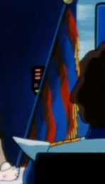 |
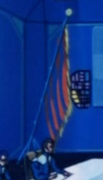
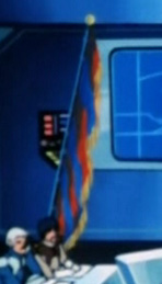
This is present in a conference room that appears in several episodes in which meetings chaired by General Leonard take place. It has four horizontal red stripes with a blue stripe beneath each red one. The animators didn't draw it very carefully and the fringe seems to have been omitted from more than just the hoist side. Apart from the military context the possibility that it is square or nearly square and that it has a fringe suggest a colour of an organisation in the UEF. However, it's too big to be practical as a colour (colours are carried on parade rather than flown from a flagpole).
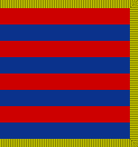 If square |
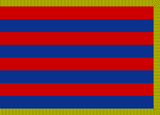 If not square |
Because the meetings we see take place in the room are chaired by General Leonard, whose position is best explained as that of Supreme Commander of the Southern Cross, we could conclude that it represents the Southern Cross. However, a certain cruciform arrangement of stars would be such a predictable motif for this command that its omission seems unlikely.
Note that the colours are very similar to the distinctive colours of the flag in Admiral Hayes's office (see above). If we interpret the colour scheme as representing the Spacy the flag therefore cannot represent a joint organisation.
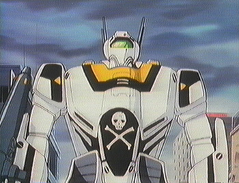
The jolly roger symbol is the emblem of Skull Squadron.
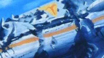
This emblem comprises a red or orange Aries zodiac symbol on a yellow triangle. It appears on a wrecked ship at Point K. It would represent either just the ship or a large formation to which the ship belongs.
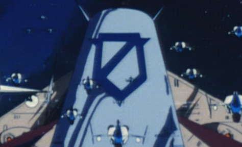
This would represent either just the ship or a large formation to which the ship belongs (presumably it's equivalent to the 'Aries' emblem above). Though it superficially resembles a perfectly conventional armorial design (a shield with a bend sinister and bordure) the proportions and the puzzling inclusion of a point on each side of the shield are inconsistent with heraldic conventions.

(That the design only ever appears 'skewed' in the animation, owing to shape of Carpenter's ship and the angles from which we see it, means that the proportions of the outline are not easy to determine confidently. So my illustration is based on the assumption that its original designer would have taken a neat and simple approach.)
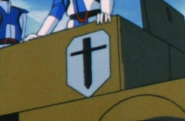
This is almost certainly the emblem of a battalion-level or greater command to which Captain Komodo belongs.

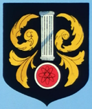
As the Doric column suggests construction and the electron orbit symbol suggests electrical or nuclear energy the best explanation by far would be that it represents military engineers. This is supported by the fact that George Sullivan is investigating the technical aspects of the Masters' ship. In SDCSC this is referred to specifically as the badge of a technical specialist. Unfortunately Harmony Gold staff bafflingly changed this line to one that refers to military police. So the best explanation would have to be that it represents a technical support organisation in a military police organisation.
To create a series of symbols to represent various military organisations, SDCSC's makers stupidly copied a number of armorial achievements of real individuals and governments and modified them very ineptly. Thankfully very few of these are actually in the animation, so we can disregard most of them. Unfortunately the one seen most frequently, which is on the Fifteenth Squad(ron)'s base, is the one that is most obviously plagiarised and egregiously incongruous.
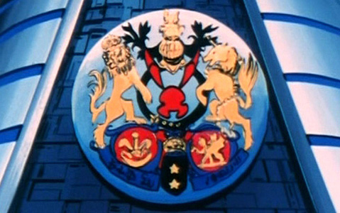
It's a mangled version of the arms of HRH the Prince of Wales, the next head of state of sixteen independent nations, as well as parts thereof in some cases, and various dependencies. Hardly the most subtle or tactful example of heraldic plagiarism. Certainly far from competent.
The distinctive coronet and the three-feathers badge of the heir-apparent of the monarch of the Commonwealth Realms, the supporters and crest lion of the monarch of the Commonwealth Realms, the cadency labels (on the supporters and crest) denoting an eldest son, a royal helm (gold and facing the front), and the Welsh dragon remain. The changes they bothered to make include several blunders that defy heraldic rules.
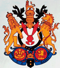
The assignment of symbols to military organisations by SDCSC's creators was based on a system of military organisation that is nonsensical and inapplicable (even if it weren't ridiculous) in Robotech's context. So what would be the best explanation for this design in the Robotech universe? It must represent a battalion-level or greater command. Perhaps the regiment of which Lieutenant Sterling's command is a part was an armoured regiment named for the Prince of Wales (e.g. 4/19 Prince of Wales's Light Horse) that belonged to a national army before being transferred to the UEF (though this still doesn't explain the specific aspects of the arms).
The text on the escroll "TAC Rabbit" remains a mystery, but I suspect that it doesn't appear in the animation with any clarity, in which case a suitable motto can be invented to take its place.
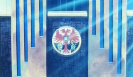
This building is the base of UEF members who are responsible for policing UEF personnel in the city and surrounding area. Assuming that the building is specific to the Global Military Police, there are several possible explanations for what its armorial achievement represents. For example:
- the GMP in general (which is consistent with the intentions of SDCSC's creators);
- the individual GMP command (battalion or greater) whose base this building is; or
- a formation or other command (not necessarily a specifically GMP organisation) of which the GMP command that occupies this building is a part.
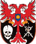
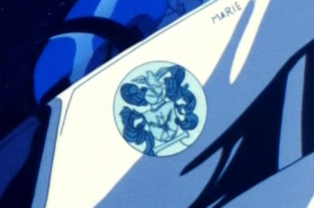
The image below shows the intended design, which, oddly, seems to include a torse (wreath of twisted cloth) depicted on the shield, which implies that the objects above it (wheat stalks and axe or halberd) comprise a crest. A crest belongs on top of a helm. The designer clearly had no idea about heraldic rules concerning colour. The torse below the actual crest and the one depicted on the shield are each of one colour, whereas a torse should have two (some armorial achievements that have a quartered shield have a torse of four colours). The mantling (shredded cloth emanating from the helm) is also coloured wrongly. The helm is that of a gentleman/esquire, which often appears in arms of organisations and governments, so its inclusion is not problematic (though I prefer that helms be limited to personal arms). The design never appears in the animation in full colour and the image above is taken from what I believe is the only shot where the design appears in the animation with any clarity (on Lieutenant Crystal's craft). Thankfully this enables us to disregard the intended colours, the text on the escroll and that the horizontal object displayed on the shield was meant to be a torse.
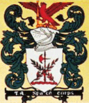
The prominent appearance of the jolly roger emblem on Skull Squadron craft implies that the emblem on Lieutenant Crystal's craft should be that of the squadron to which it belongs (ignoring the nonsensical intentions of SDCSC's creators).
 |
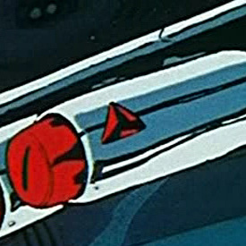 |
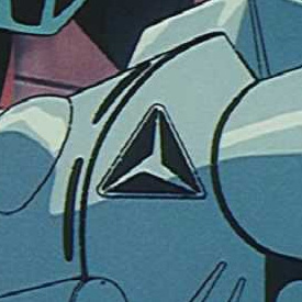
This design appears on UEF equipment containing protoculture (machines and ordnance) several times. The main elements are an equilateral triangle with rounded corners and a triskelion that is identical to a three-pointed star (as in the Mercedes-Benz logo) with half of each ray omitted. Colour scheme varies.
 |
 |
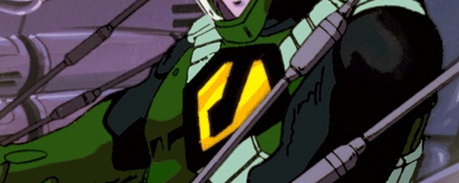
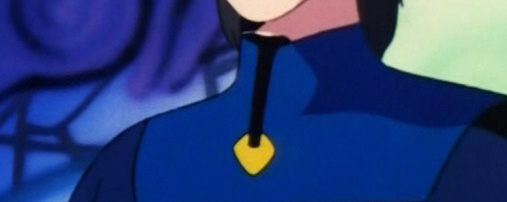
The best explanation for the design of this gorget badge is that it is the emblem of the Masters' military organisation, in which case its similarity to the Zentraedi emblem is very appropriate.
| OTHER ARTICLES | vofr.tripod.com Copyright © 1998 2015 |